RADICAL ATTENTION
 HOWARD YEZERSKI GALLERY


MAY 3-JUNE 4, 2013
460 HARRISON AVENUE
BOSTON, MASSACHUSETTS
REVIEW BY CATE McQUAID, BOSTON GLOBE, MAY 29, 2013
PLANAR PERCEPTIONS
It's a joy, now and again, to return to the simple complexities of painting. Catherine Kehoe, whose latest show is up at Howard Yezerski Gallery, has such a keen way of seeing that even her smallest paintings suggest there’s ever more to perceive.
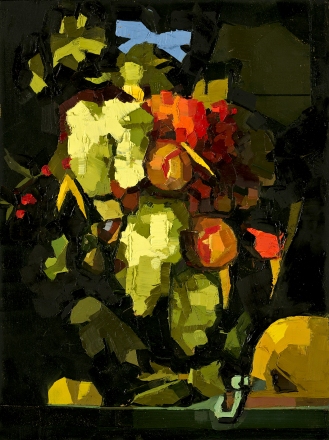
She offers a couple of still lifes on small black blocks; they appear to project and recess at the same time. In “Grape still life (after de Heem),” the individual fruits are undefined, but drape in patches of green, glistening and lean, thanks to the always planar quality with which Kehoe constructs her forms, so that everything seems like a reflection off the clean face of a prism. Faceted, they shine like gems. Yet they’re painterly, smudged, organic and not crystalline.
Every shape, every line, every tone is a considered piece of the whole, which sets Kehoe’s paintings teetering between representation and abstraction. “Frosty” has at its center an inflatable snowman circled by a hula-hoop, wearing a yellow blow-up ring around his neck. I didn’t see any of that at first; my eyes were so enchanted by the play of forms, the tangy bursts of color, the circles within circles.
Kehoe’s paintings remind me of Mary Oliver’s line from the poem “Wild Geese”: “. . . the world offers itself to your imagination.” A snowman, a circle, a dab of orange — oh, the possibilities.
It's a joy, now and again, to return to the simple complexities of painting. Catherine Kehoe, whose latest show is up at Howard Yezerski Gallery, has such a keen way of seeing that even her smallest paintings suggest there’s ever more to perceive.
She offers a couple of still lifes on small black blocks; they appear to project and recess at the same time. In “Grape still life (after de Heem),” the individual fruits are undefined, but drape in patches of green, glistening and lean, thanks to the always planar quality with which Kehoe constructs her forms, so that everything seems like a reflection off the clean face of a prism. Faceted, they shine like gems. Yet they’re painterly, smudged, organic and not crystalline.
Every shape, every line, every tone is a considered piece of the whole, which sets Kehoe’s paintings teetering between representation and abstraction. “Frosty” has at its center an inflatable snowman circled by a hula-hoop, wearing a yellow blow-up ring around his neck. I didn’t see any of that at first; my eyes were so enchanted by the play of forms, the tangy bursts of color, the circles within circles.
Kehoe’s paintings remind me of Mary Oliver’s line from the poem “Wild Geese”: “. . . the world offers itself to your imagination.” A snowman, a circle, a dab of orange — oh, the possibilities.
Press Release, Howard Yezerski Gallery:
Howard Yezerski Gallery is pleased to present Radical Attention, an exhibition of Catherine Kehoe’s latest paintings. Kehoe isolates perception in angles of color. To describe them requires contradictions. Her palette settles obliquely and comfortably into the small panels. Her attention is focused, bold, and ruthless.
The paintings are radicalized sight, not taken to hyperrealism but instead to balance. They find equilibrium between detail and abstraction, harmony in the descent of a line. Kehoe has a careful and intuitive palette, balancing warm, rich neutrals against surprising bursts of yellow and pink.
Perception is elevated – a fluctuating subjective that must be recorded. She looks through the surface to the source of beauty in the thing. The truth of the object comes through the geometry between the soft, knowing grey and the defiant fuchsia.
Bold is not the right word for these colors. It implies a kind of recklessness that Kehoe does not know. She knows these objects, and the colors are only exactly right. They seem to emerge from within – a recognition of essence.
Her strokes organize and structure; each simultaneously mutinous and obsessively faithful to the image. In his catalogue essay, John Yau describes Kehoe’s process as “building a model of her perception of the thing.” Perception is queen and she trusts it.
Each painting follows an instinct for the truth behind the object, trusting the image of shadows and angled cheekbones to reveal their own intention. It is Kehoe’s trust that catches your heart in these tiny paintings – you are drawn to the strength of the colors and shapes across a jaw. She has leapt and been caught by the things themselves.


